Any color, in context...
Maroon. Does the word make you cringe?
Maroon might be the most misunderstood color under the sun as it’s one of the trickiest shades to interpret in a way that doesn’t feel dated. It’s the color most often ripped out of musty shag carpets in 1970s ranch homes across America. It was also the color most widely used on dining room walls in the 1990s. You know which one I’m talking about because every home on the block had this color with a chair rail. And court rooms, yeah, they tend to have it on floors as well. So I get it; this one comes with some strong feelings.
But any color can feel fresh in the right context.

My favorite way to use maroon is with pastels. When maroon is paired with light yellow, lavender, turquoise…it’s unexpected and really shakes this color up (along with all your preconceived notions regarding this hue).

With the right pairing, all of a sudden maroon becomes current and feels totally modern.
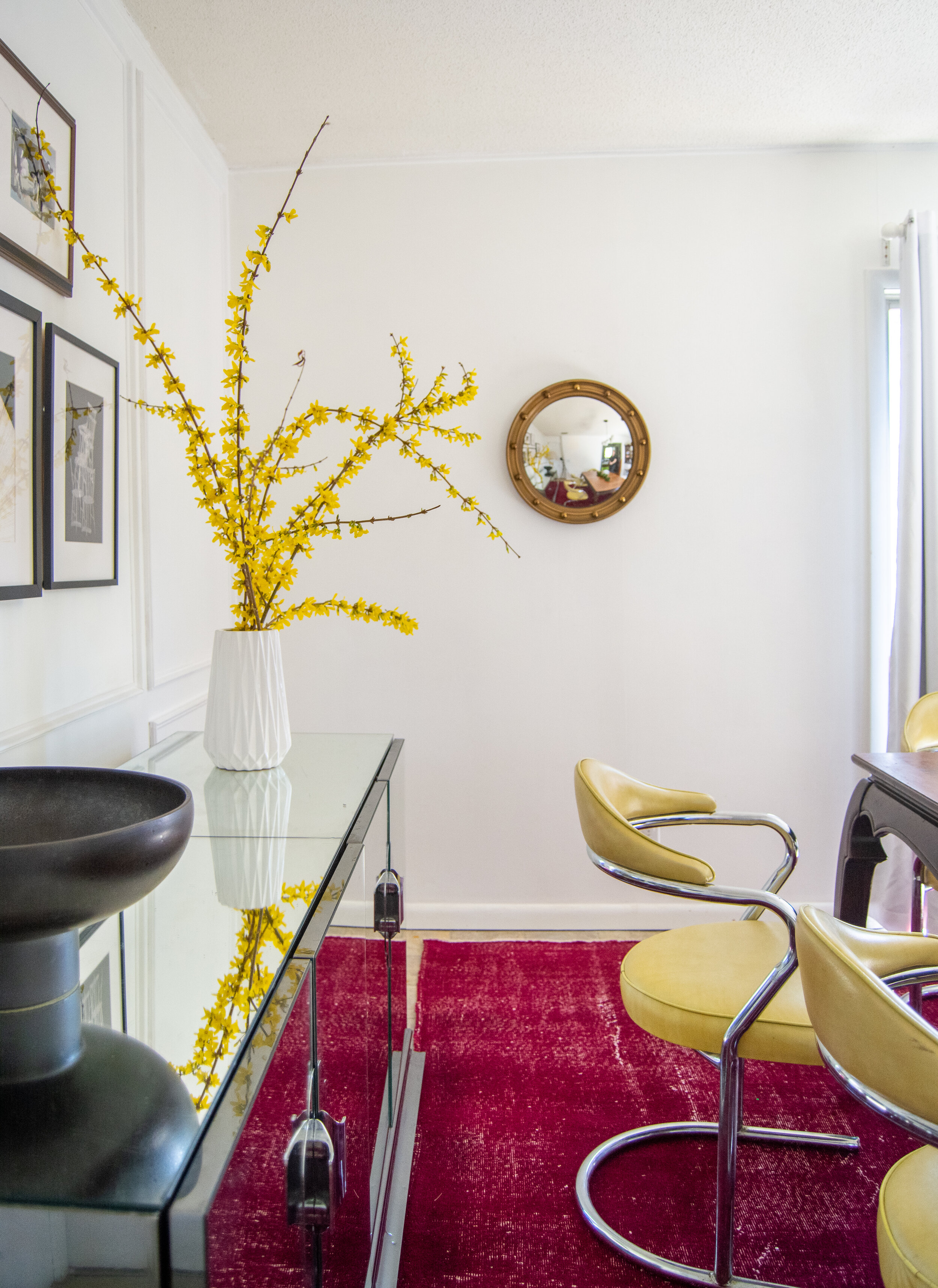
I paired this color with lavender ottomans and a turquoise cowhide rug in my home office.

Here are some of my favorite, unexpected maroon paint color pairings

So no matter the color, it can feel like it belongs in this decade with a thoughtful pallet!
Do you have a color you love but aren’t sure how to use in your home?