Hausmatter Interiors Fall 2019 One Room Challenge BIG REVEAL
I’ll have to admit, I had no idea what I was getting into when I committed to this challenge. I’ve never put a room together at such break-neck speeds in all my life. The result has surprised even me as the designer.

So what is the One Room Challenge? The One Room challenge™, currently in it’s 16th season, provides participants with a supportive, enthusiastic forum in which to share the process of transforming a room. The ORC is not a competition, but rather a celebration of creativity, inspiration, and original ideas. The widely anticipated biannual event occurs every April and October. Each round, featured designers and guests take the challenge to transform a space over the course of 6 weeks. Each week, the internet and social media are flooded with interior design inspiration, ideas, and encouragement.

A look back at week one of this challenge and you can see I started off with a totally different plan. Because of so many time constraints and obstacles, I ended up with a very different room. It has challenged my Type-A, OCD brain to go with the design-flow, and I kind of love that.
Now I’m not going to lie to you; it wasn’t easy. There was cursing. Binge eating. Dreams about rugs. Nightmares about rugs. Wine. I may even have lost my mind a little at times. I’m so glad I stuck with it and let this room unfold before my eyes.
BEFORE
I can’t take credit for this one. Would you believe this was the photo used to advertise the rental?

Image Via Trulia
Now let’s dig into the AFTER, shall we?
Every time I try to take a break from color, THIS happens. BIG, BOLD, BEAUTIFUL, COLOR.
The color boomerang threw me and I landed right back at its vibrant feet. I originally intended to create a neutral design for this room, but honestly, this is not that house. What do you do when you have a boxy room with low ceilings, void of a single ounce of architectural interest? You slap it silly with color and pattern.
Oh, and did I mention this is a rental space? Okay, so I had my work cut out for me. I knew I wanted to give it life and character, but how? Popcorn ceilings meant nothing groovy was going to happen up above, so first thing I did was choose this beautiful blue paint color for the back wall. The color is Fiji by Benjamin Moore. It’s a gorgeous, medium toned shade that really pops but also manages to be soothing at the same time. Blue is kind of special like that.
If you remember from week one, I said I was going to install my version of cheesy, 80s faux columns. Okay, so this isn’t a column, but you get the idea. I wanted the feel of some luxurious moulding and trim. Since this is a rental, I needed to come up with something temporary and inexpensive. So I used tape! You read that right, good ol’ tape. I selected a 2”, crepe paper, white masking tape. It’s been up on the wall since week 1 and is holding on like a champ.

Now let’s talk furniture
This vintage, burl wood opium-style table was one of the first pieces of furniture I bought for myself in my 20s. It’s perfectly imperfect. I love it as much now as I did then. Case in point; buy what you love, and buy good, quality pieces. If you do, they will always find a place in your home.
Once I saw how amazing these 1970s, chrome yellow chairs looked against the blue wall, a color scheme began to develop.
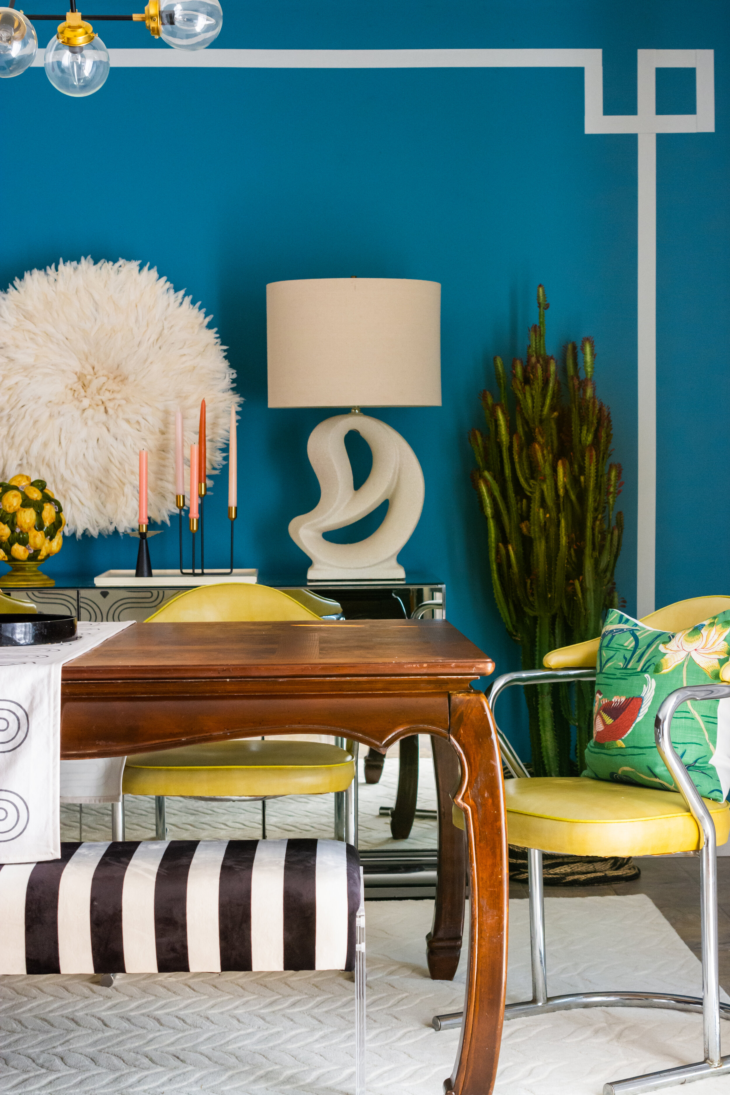
The only issue was, I only had four of them, and my table seats 6-8. My solution was to try to find a bench that would be a nice juxtaposition to the chairs. I didn’t want to match up the chrome. Brass clashed with the silver tone. Wood felt too heavy with the table. Leather was too much with the vinyl chairs. It really needed to be something totally different material-wise. I decided to go with this lucite, stripy bench, and boy does it pack a punch!
I love the barely there, transparent legs against the bold, contrast of the upholstery. This bench seats three comfortably, so we are able to sit even more guests than the other side with two chairs. Can you even put a price on being able to invite one extra dinner guest? I feel kind of lucky.

With the table and chairs figured out, I then moved on to art. I wanted something that would really pop on the back wall, but most importantly, it needed to be round to balance out the squared lines of the Greek Key border. I decided to go with a Juju hat in ivory. I love the texture it brings to the space. It also gives this room some much needed dimension as it stands off from the wall a bit.

Next was to tackle lighting. In addition to the overhead light, I knew I also wanted something softer for cozy nights at home. I looked at several sconces, but ultimately decided table lamps would make more of an impact, and since I had this art deco, mirrored buffet, I had the perfect place to put them. I pulled these post modern lamps from my chairish, and the curved shapes did just the trick on this geometric wall.

I love the ivory scheme that developed here.

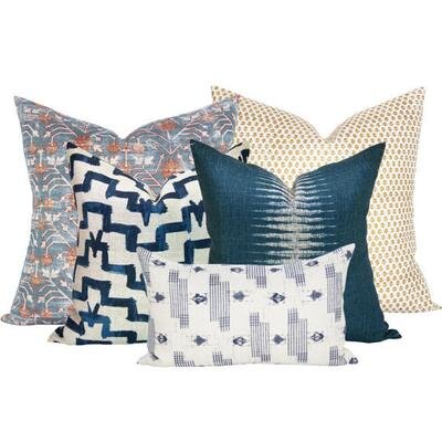
I’m not normally one for cushions in a dining room. They feel fussy to me if someone has to remove them in order to sit down. But this room was crying for some florals, so I decided to set my rule aside and consider a small cushion for the end chairs. I’m so glad I did. These Schumacher Lotus Garden pillows were custom made by Spark Modern. All of their cushions come in a variety of sizes so you can find a perfect fit. They aren’t fussy in this room at all and make a comfortable chair, even more comfortable.

This abstract painting by Tracey Nicholos was another piece I chose to soften the lines in the room. The vibrancy of the pinks and corals are a welcomed surprise in this room’s blue and yellow color scheme.

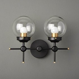
Like nearly everything else in this space, choosing the right ceiling light wasn’t easy. I needed a metal that would compliment the chrome chairs and I needed to make sure the light didn’t distract from the focal point I created on the back wall. It needed to be wide enough for my table, have curved lines, and it also needed to rest somewhere between the taped line and juju. Whew! I had my work cut out for me. Since I didn’t want a chrome fixture, I decided to mix metals. I fell in love with the Illuminate Vintage selection of fixtures on etsy. I selected the Austin light in black and raw brass with clear glass globes so you could see right on through to the back wall.

I love how this runner from Celine and Kate pops on my burl wood table.

I like using fruit as an alternative to florals in a kitchen because they ride the line of feminine/masculine, and well…conjure up an appetite! These prints by Belle Botanica have a vintage feel. With the background being white, the focus is on the beautiful illustrations. To add contrast to the prints, I added black frames.

Is there anything better than lemons and stripes?! I think I’ll have a margarita in my imaginary cabana to celebrate the completion of this room. Join me?

Selecting a rug for this space was maybe the most challenging part because it was the last decision to be made, meaning there were more elements to consider at that point. There are so many rug colors that could work in here; pinks, peaches, blues, oranges, yellows, greens. Oriental rugs, Floral rugs, rugs with dots…Dr. Seuss could have narrated all of the rugs I looked at. Rugs that looked good on the mood board, didn’t feel right when I got them in the room. Most of what I tried felt too busy and overwhelmed the space. It was starting to feel like Pee-Wee’s funhouse in here with the addition of a rug. My eyes had no place to rest. It wasn’t until I took all the rugs away that I realized I loved the room even more. But, and it’s a big BUT, no rug was not an option, because… OLD RENTAL LINOLEUM FLOOR WITH MYSTERY STAINS. Do I need to say more?
So I ended up going with this neutral, wool rug. The texture and color compliment the feathered juju and anchor the ivory colors on the blue wall. With all the stripes in the room, it’s nice to have a big piece like this with so much movement.

This room quickly became a lesson in balance for me. Too much of this, add a little of that, or take away a little of this. For each place I brought in a bold line, or geometric shape, I tried to balance it with curves and pieces that had some flow. Achieving balance is quite a challenge when the room is small and all of these elements are closer together.
I’m happy with the result. What do you think?

And there you have it! A big thank you to Linda for creating/hosting the One Room Challenge and Better Homes and Gardens for cohosting this event! It’s a choose your own adventure, roller coaster of a ride, and I can’t wait to do it again.
Rocco is excited, too, but he is also ready for a break from rug shopping.
Photo by Anna Hedges
Thanks so much for stopping by to check out my space and please be sure to see what the other participants have created here
SOURCES
Paint color: Fiji by Benjamin Moore
Striped wall made using: ProTape
Lamps: Hausmatter vintage
Table: vintage
Chairs: Hausmatter vintage
Table runner: Celine and Kate
Bench: Tov Furniture
Pillows: Spark Modern
Lemon topiaries: vintage
Lemon wall art: Belle Botanica
Juju: Surface Abroad
Rug: Wayfair
Oil Painting: Tracey Nicholas
Ceiling light: Illuminate Vintage
SPONSORS