The perfect neutral paint color (you can use in your whole house)
Hunting down the perfect paint color isn’t always easy. In fact, you may be surprised to find out it is not something that always comes easily to designers either. Particularly when it comes to neutrals. We use our tried and true neutrals repeatedly - the one’s we have experimented with in various settings and can vet will work. So I am going to let you in on another little secret of mine: Many of the paint colors I use actually come from objects or things in my own home. Yep, they aren’t always the latest, trendy paint color, but colors I have custom color matched! I think this is even more useful when it comes to finding a neutral (and you’ll see why below)

the perfect whole house neutral paint color
For this bedroom project, I took some drapery panels in to have the paint color matched for these stripes on the wall. You can see how incredibly close they are able to match the color:

bedroom with horizontal stripes
In this bathroom design, I color matched the gray in the wallpaper for the doors and trim.

wallpapered bathroom
So lately, I’ve been spending some time searching for the perfect neutral paint color for my north facing living room, which get's very little natural light, particularly in the Winter.
I did what I always do for my interior design clients, and tested several paint samples, studying how they looked at various times of day, in natural and artificial lighting.

testing neutral paint samples
Neutral colors can be quite tricky because of the undertones. In dark rooms, they tend to appear green 90% of the time (which isn’t a bad thing at all if that’s what you are after).
Even popular colors like revere pewter can feel quite dark in a north facing room.

paint colors from top left: revere pewter, abalone, balboa mist, jogging path, shoreline, barren plain, collingwood, wheat bread
So I scratched the idea of looking through my samples for this project and decided to go with my tried and true route - color matching something in my home. The reason this works so well for me, is there are no surprises - you can see what you are going to get and how it will look in the room. In this case, I had a wallpaper sample that had the perfect, creamy neutral background. I took it into the paint department at Lowes and they matched it to a T using their color-match technology!
So how does it work?
They simply scan the object, and it produces a formula for them to mix. It doesn’t work with screenshots or images on your phone - you have to have the physical item. Fabrics can be harder to match, but not impossible. Other items, like paper, they can match with almost 99% accuracy. You just need about a 1 inch square of the color for them to get their scanner over it to color-match.
My latest color match - The perfect neutral:
For those who want more depth than a stark white, but don’t want to go gray or beige, this is a great choice.
It is neither warm nor cool.
It has no green, pink or yellow undertones
It can hold it’s depth, even when light floods the room.
It’s light enough to use in your entire house. And, you’ll learn below how you can enjoy variances in undertones based on lighting, so even if used in the whole house, it won’t look the same in every room (this goes for any color though)!
It will work with any color or decor
It is neither gray or beige. One could call it a greige, but it’s much closer to a white. It falls into the cream/off-white/ivory category. It almost appears like the inside of an almond. Or the top of a foamy latte. At night, it turns into a frapuccino. Either way, it’s bound to make you have some cravings LOL

the perfect whole house neutral paint color
For fun, and just to show how you don’t always need an accent color for contrast, I painted the fireplace the exact same color. You can see how it appears lighter in the forefront compared to the shadows of the wall. It’s subtle but there is dimension between the two just by the highlights and shadows of depth.
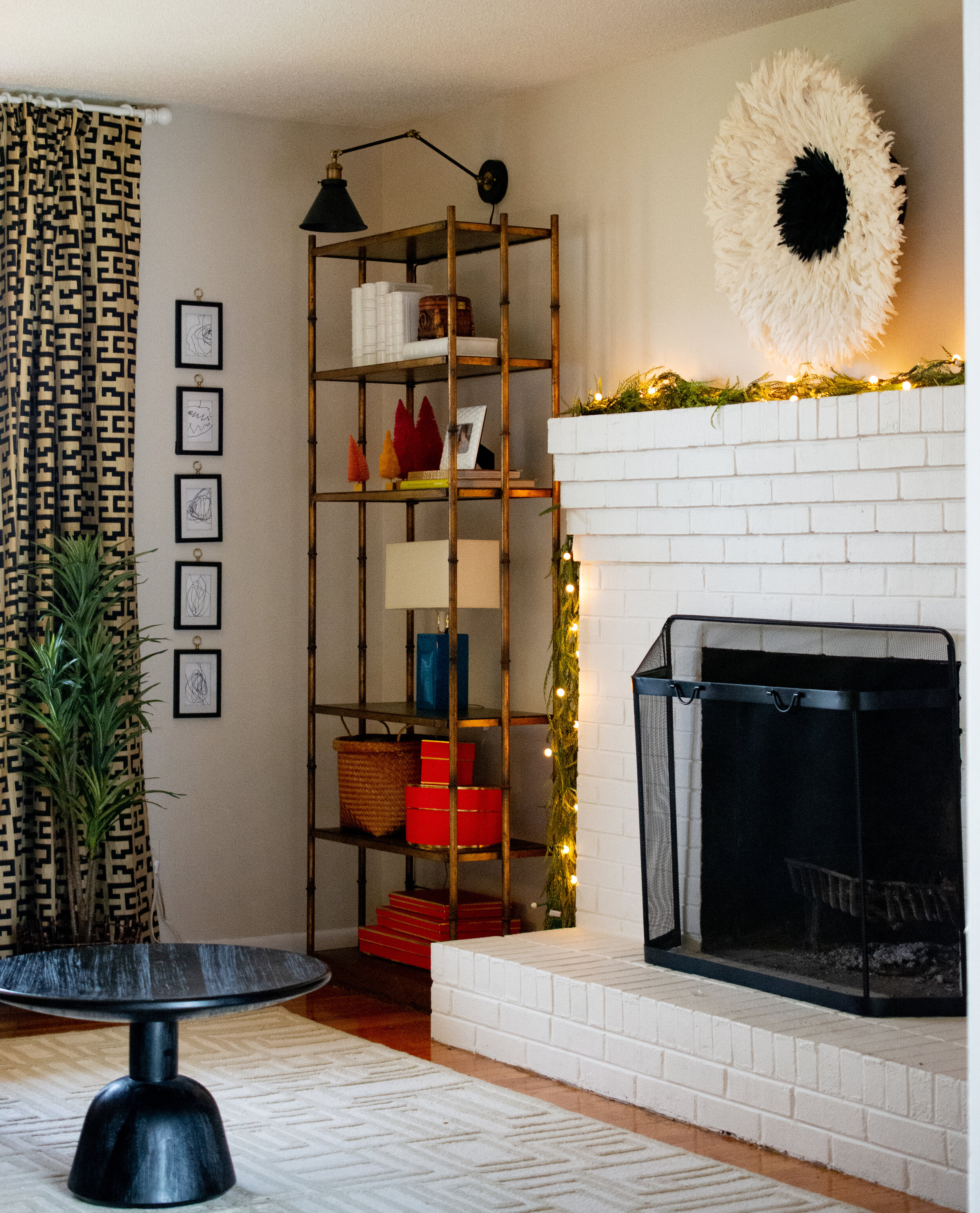
a neutral paint color you can use in your whole house
Now let’s talk undertones
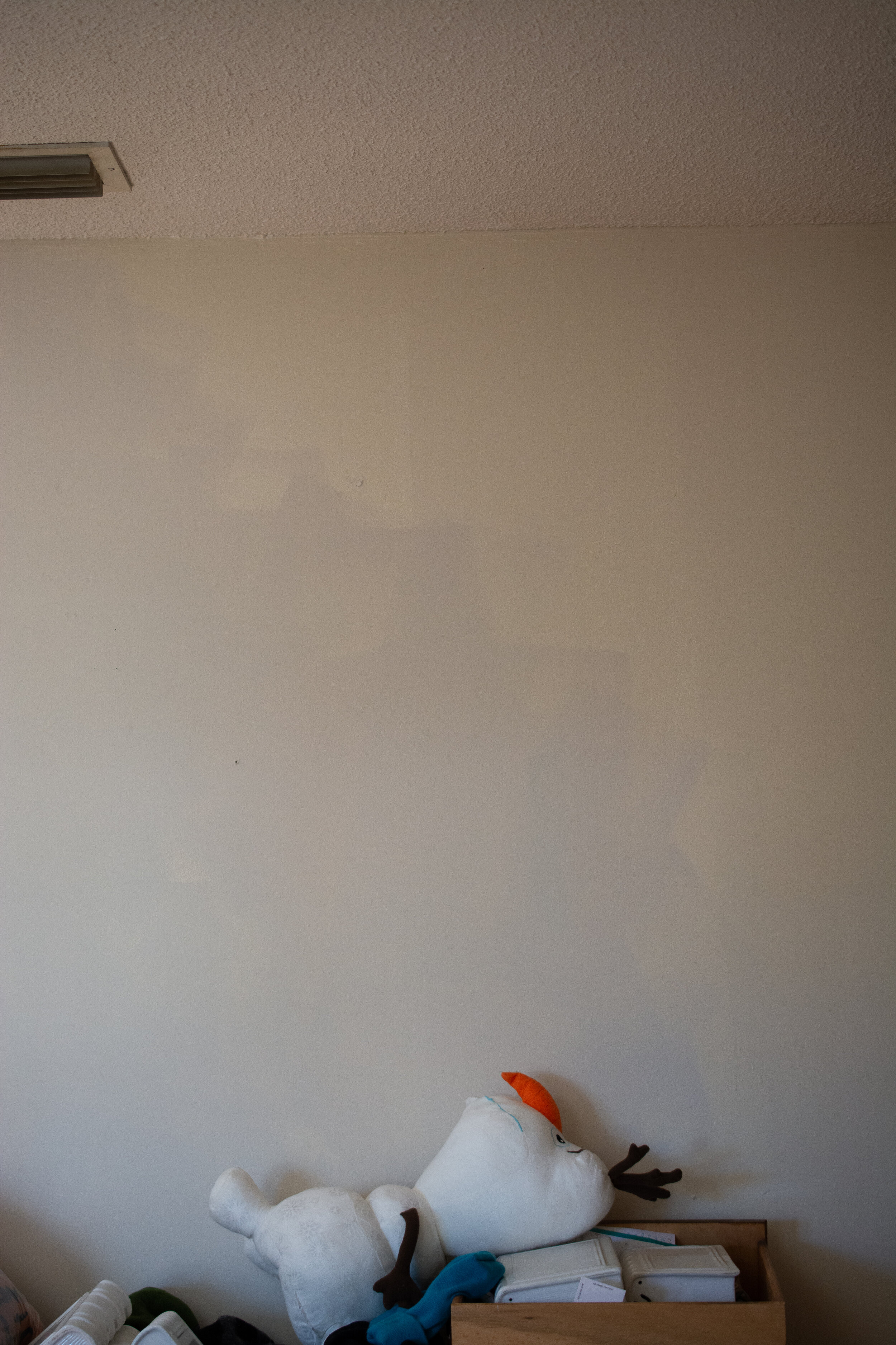
Here you can see where I painted over the former color (Honey beige by Behr). The new color on the left appears almost blue against the yellow and pink undertones of the former color (on the right). This is why undertones are so important! They are sneaky little devils. The new color has slight blue and black undertones, which become more apparent when compared to the heavy yellow and pink undertones of the previous color; however on it’s own, it does not appear blue. Since it is a cream color, it does have yellow in it, but the blue understones makes it much more balanced. You’ll notice the blue/gray more in darker rooms and it will appear more yellow in daylight.
(Also, Olaf for realness LOL)
a neutral paint color you can use in your whole house
In the photo below, you can see how nicely this color looks against pure white trim as well. It has no sneaky pink or yellow undertone.

a neutral paint color you can use in your whole house
In this unedited photo (same room), with the sun shining, it brings out the warmth, much like a beige.

a neutral paint color you can use in your whole house
And in another angle of the room, at the same time of day, it appears more gray in the shadows:

a neutral paint color you can use in your whole house
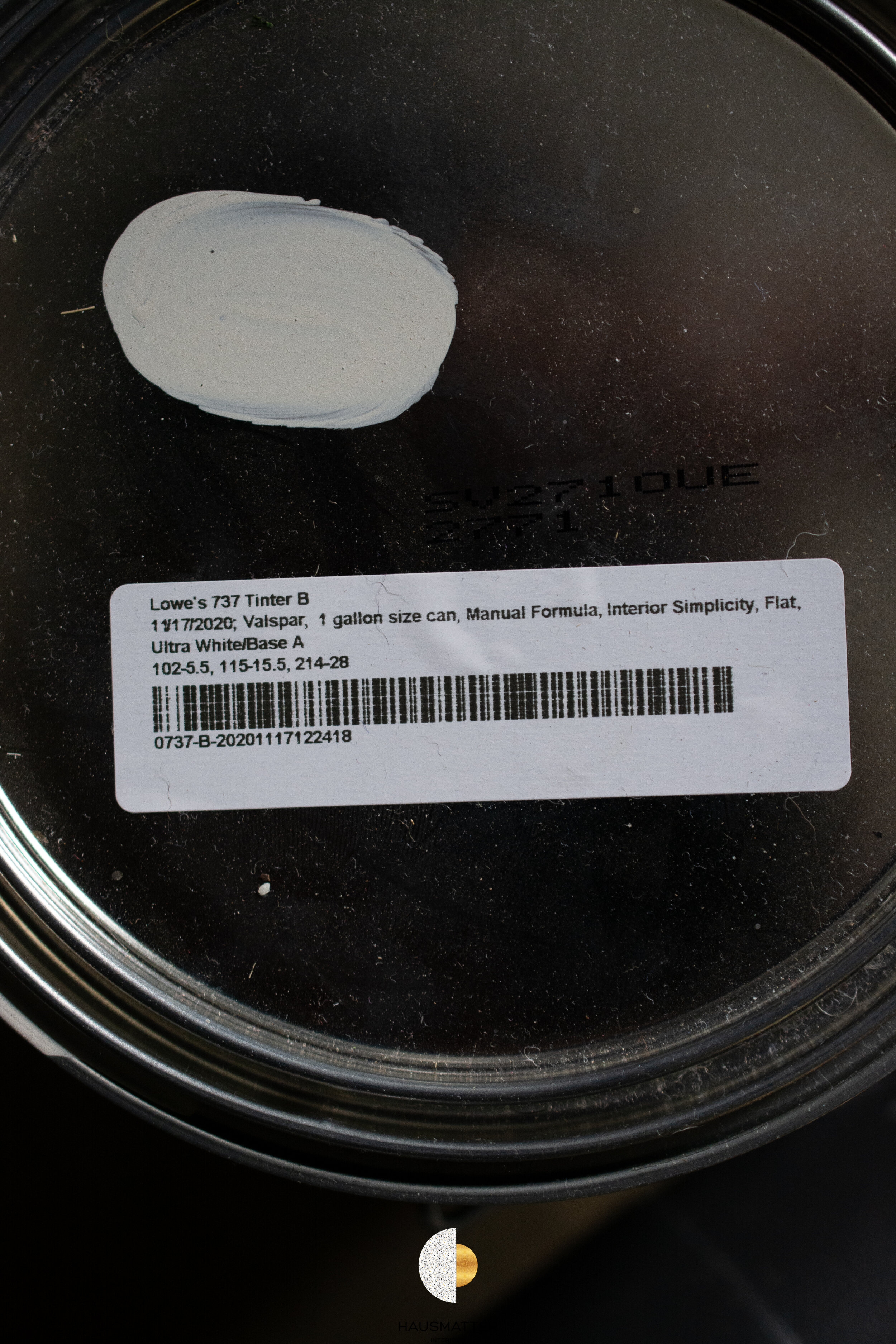
So what is this color with no name? Below I have attached an image of the formula for you to take into your local paint shop. This is a color you can confidently use in your entire home and enjoy how it presents itself in different tones based on the lighting. But most importantly, it is a neutral that WON’T darken your space and WON’T appear pink, green, yellow etc.. It’s just a trusty neutral color.
And there you have it! Please let me know if you use this color - I would love to see a pic :)

a creamy white neutral paint you can use in your whole house