Family Home Office Reveal
This year has been filled with adjustments, and our home as been no exception. Since Covid hit, my clients have been requesting remote services, so I had to think quick on a way to transform a room in our small brick ranch to accommodate my studio. Oh, and there was all that extra time at home with my daughter who loves to be right where the action is. And then there was the halt to my gym membership. And all that crafting we were furiously doing to distract ourselves 😆
So this room needed to function as a:
interior design studio
zoom conference center
gym
homeschooling room
sample room
game room
craft room
This room needed to wear a whole lot of hats, and with it being just 10x10 feet, I needed to make sure I utilized every square inch!
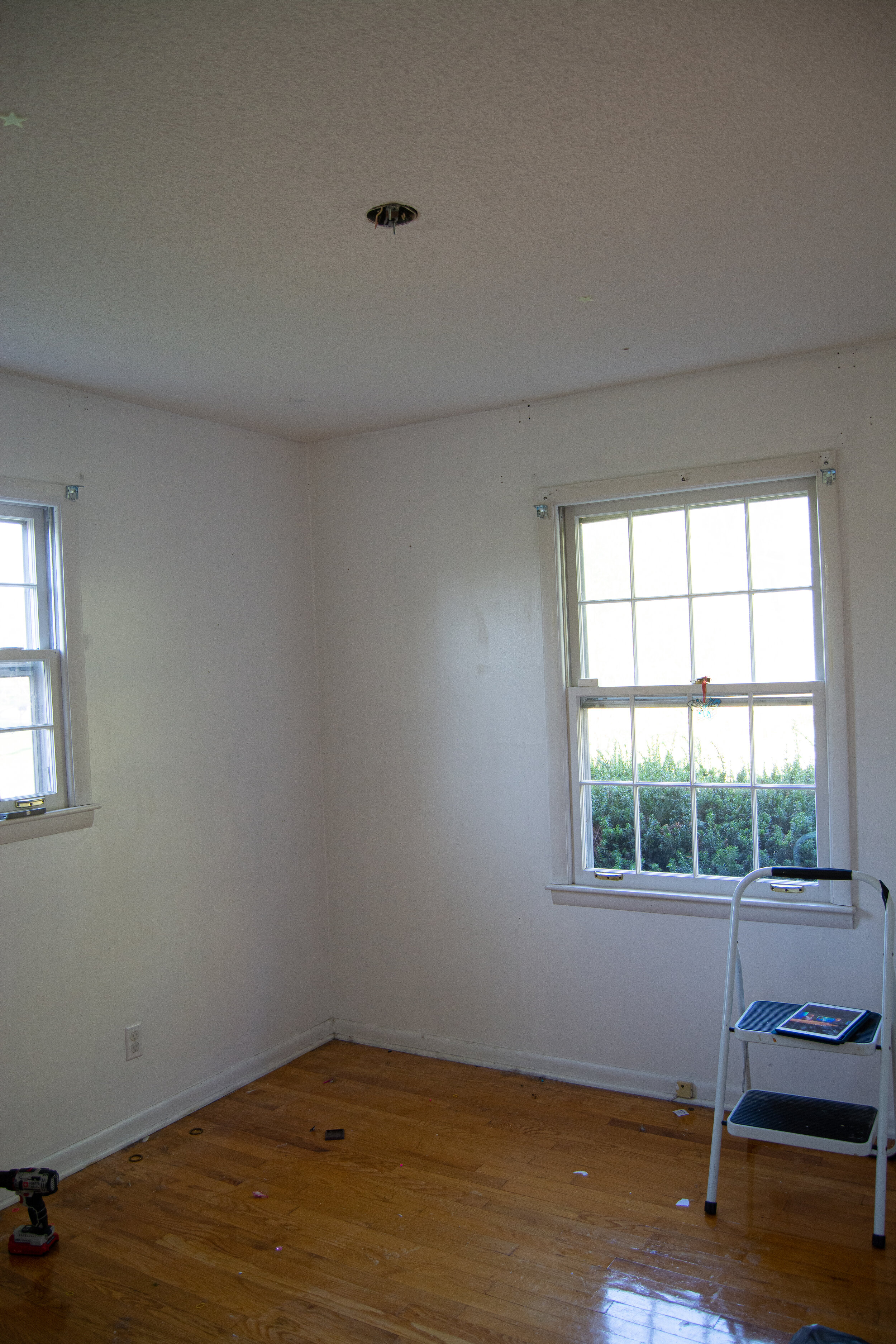
BEFORE
office before
The first thing I did was remove the popcorn from our 8 foot tall ceiling. If you recall my tips from my previous post on making ceilings appear taller, I painted the ceiling the same color as the walls, as well as the trim. To gain much needed storage, I refinished these ikea shelves to provide much needed storage (I’ll post a tutorial soon!). Painting them the same color makes them feel like custom, built-ins. I can’t believe how perfectly they both fit in this space. I honestly loved the room just like this, but I then I remembered the above list.
Halfway mark
office with DIY built-in cubbies
***Drumroll***
AFTER
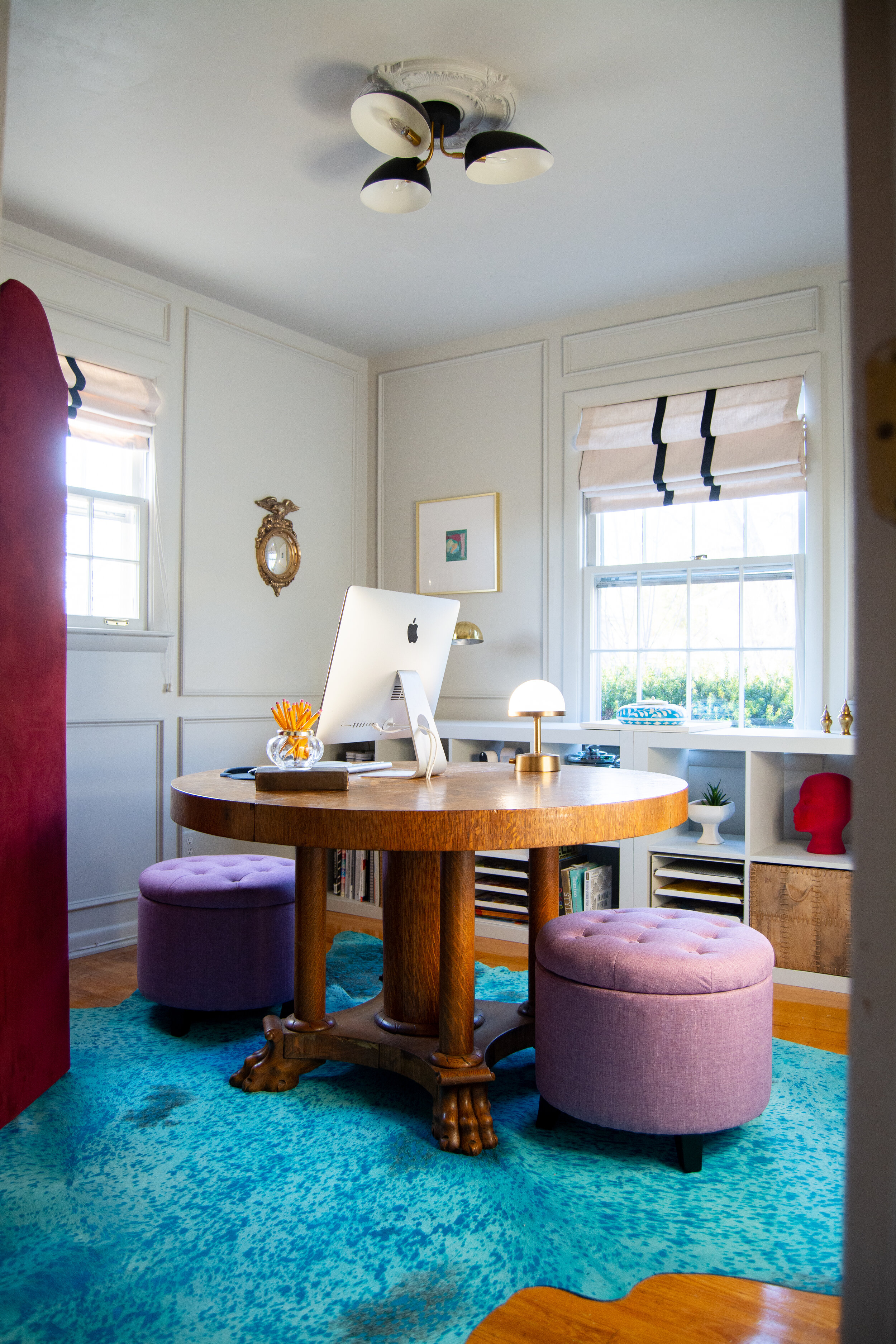
This room has such good vibes now. I love the way colors pop against this milky matte gray. And the custom picture moulding my husband built makes the room feel extra fancy!
gray office with pops of color and center desk
The biggest decision to be made in this room was definitely the desk. I considered two back to front desks, but that would only fit two of us, so I opted for a round tavalo table. It’s unexpected and totally functional. I just love the coziness of a round table - it practically forces all who sit around it to connect!
I took inspiration from libraries, studies and particularly, elementary classrooms. I really pondered the anatomy of a kids classroom and why they were so practical. The round table (or U shaped table as some have) keeps the kids engaged and makes supplies easy to hand out.
And upon finding this antique table, I couldn’t see straight after looking at those claw feet and that tiger oak grain! The date on the lever of the table says 1907. There are many flaws in the veneer but it makes me love it that much more. Just thinking about the history….can you imagine all the meals this table has seen??
antique clawfoot table
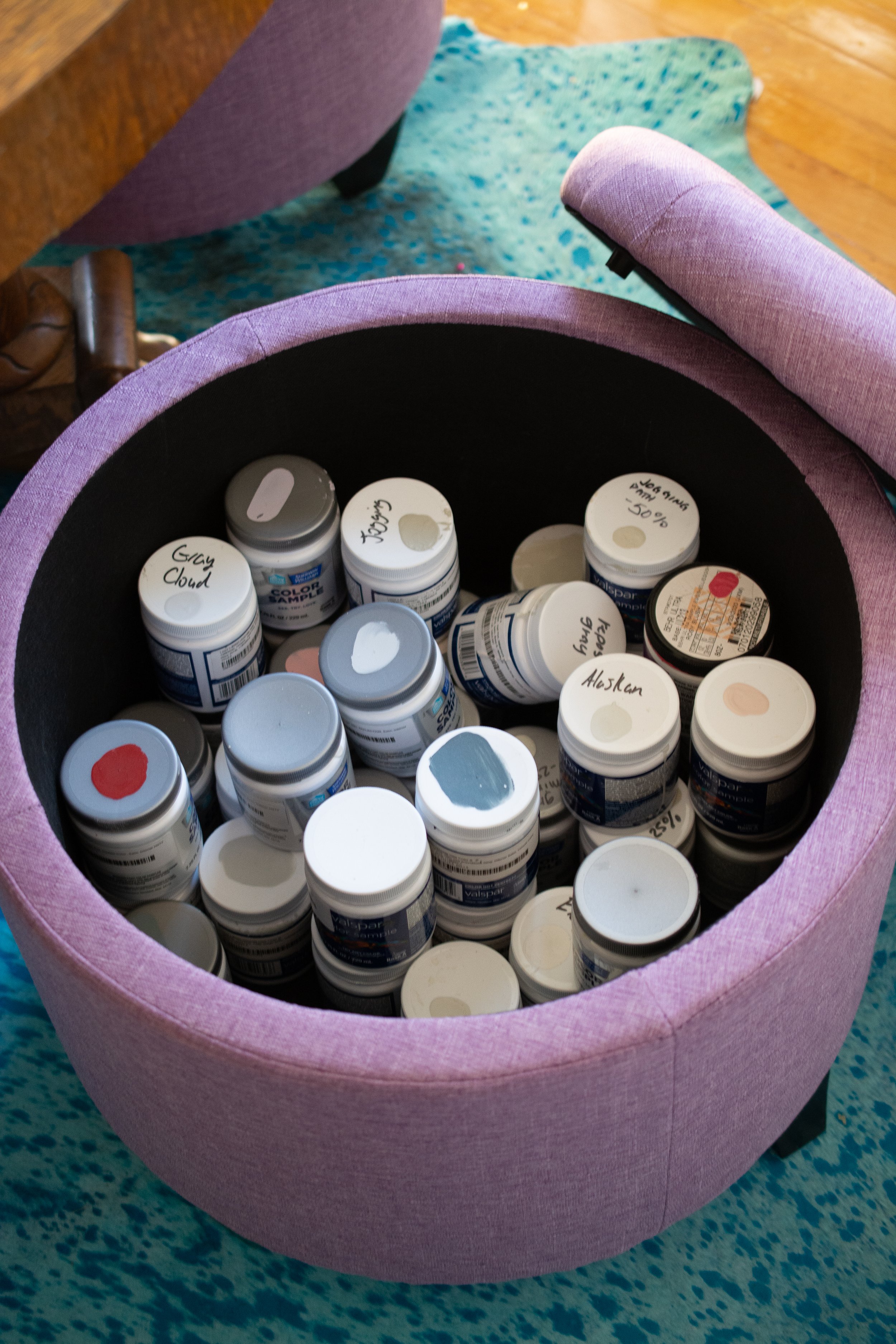
Because space is SUPER TIGHT in here, I didn’t want to bring in chairs. I opted instead for ottomans that can be tucked all the way under the table. They take up less space visually, and have lots of storage capacity. It’s a win-win!
family home office
Now I have plenty of room for my paint samples.
And my daughter has her own space to store craft supplies which she can reach all by herself - can I get an amen?!
ottoman storage
ottoman storage
A pop of black never hurt anyone. I love the way this modern fixture looks against the ceiling medallion.
modern light fixture with ceiling medallion
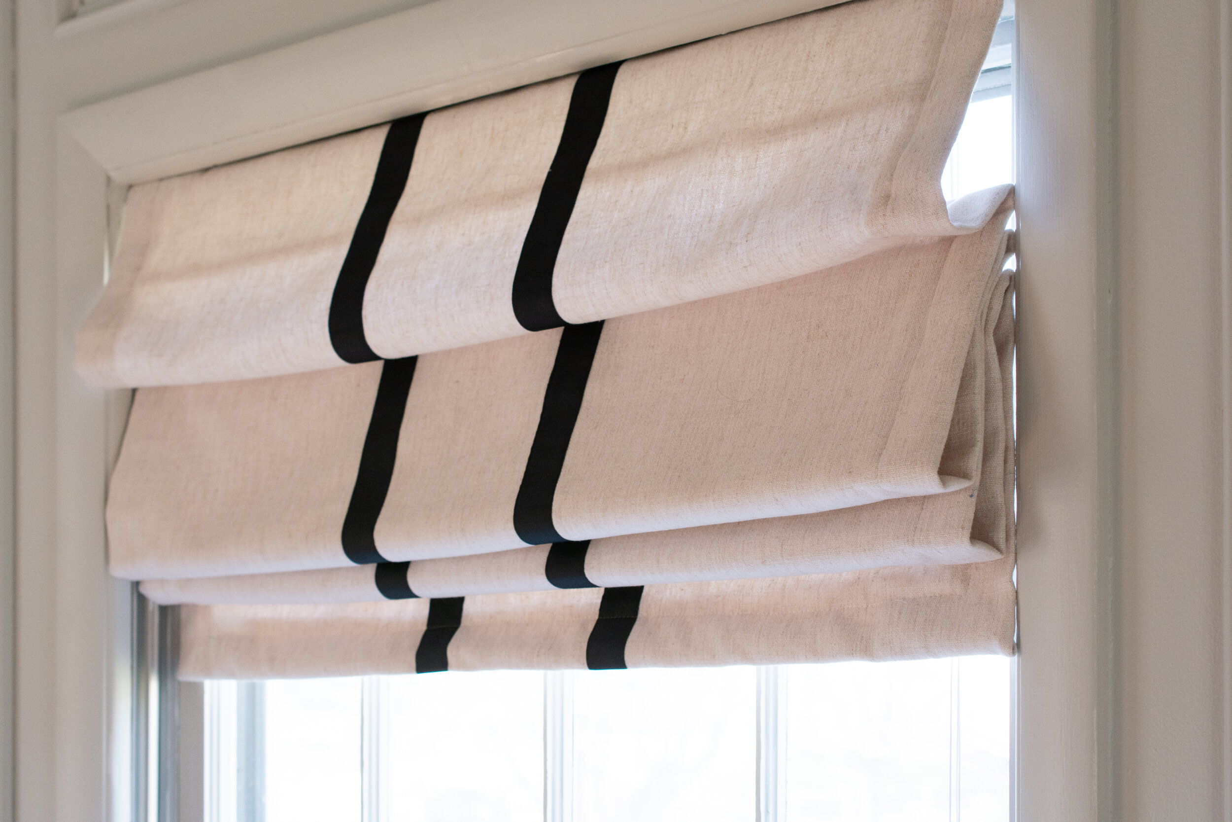
I carried the black throughout the room, outfitting the windows with custom-made roman shades I designed, and had made by Sew Lovely by Kelly. Since there are so many loud moments in the room, I’m really glad I kept it simple with the window treatments. Kelly did an amazing job - the craftsmanship is unmatched. Highly recommend!
roman shades with stripes
An acid wash, Turquoise cowhide rug. Are we having fun yet?
turquoise cowhide rug
Now onto storage. After I refinished the ikea cabinets, and got them in the room, I realized I had more than enough storage space with all these cubbies.
ikea hack builtin
They are mostly housing my interior design materials, but there is also a lot of room for puzzles and craft supplies.
puzzle storage
craft storage idea
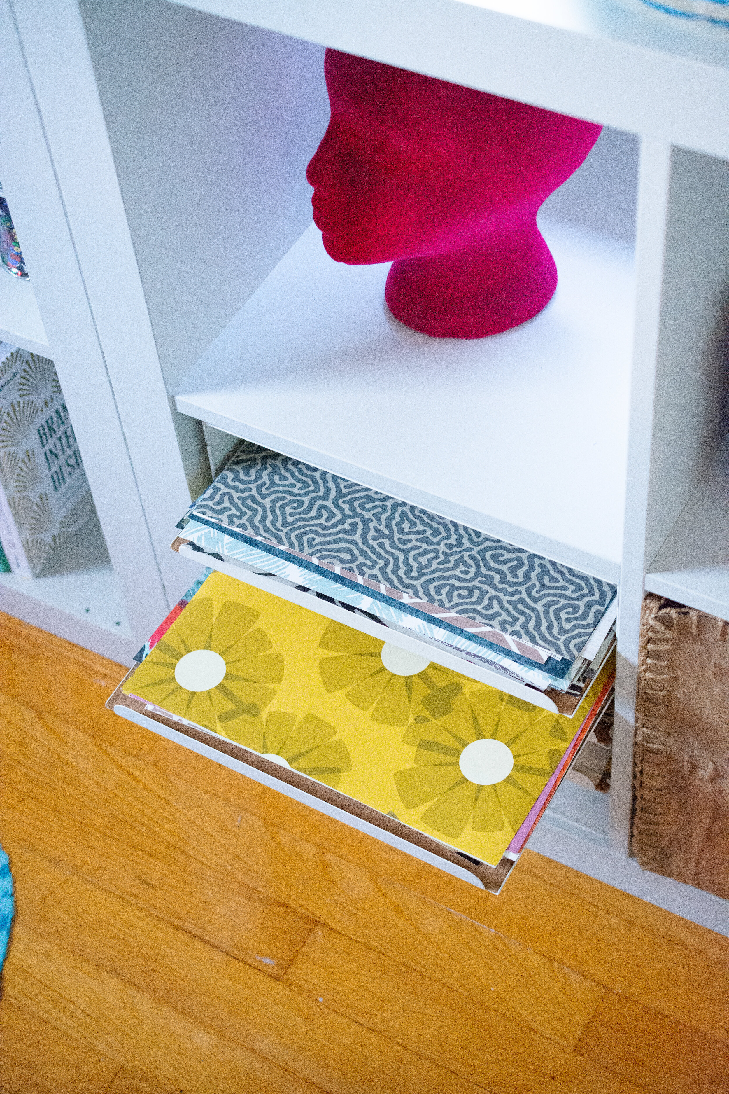
Now my wallpaper samples are at arms reach…
cardstock storage idea
To make the shelves feel special, I added these medallions to each corner. It definitely feels custom and not at all like ikea!
ikea hack builtin
I brought in some vintage brass accessories to calm down the gray.
brass urns
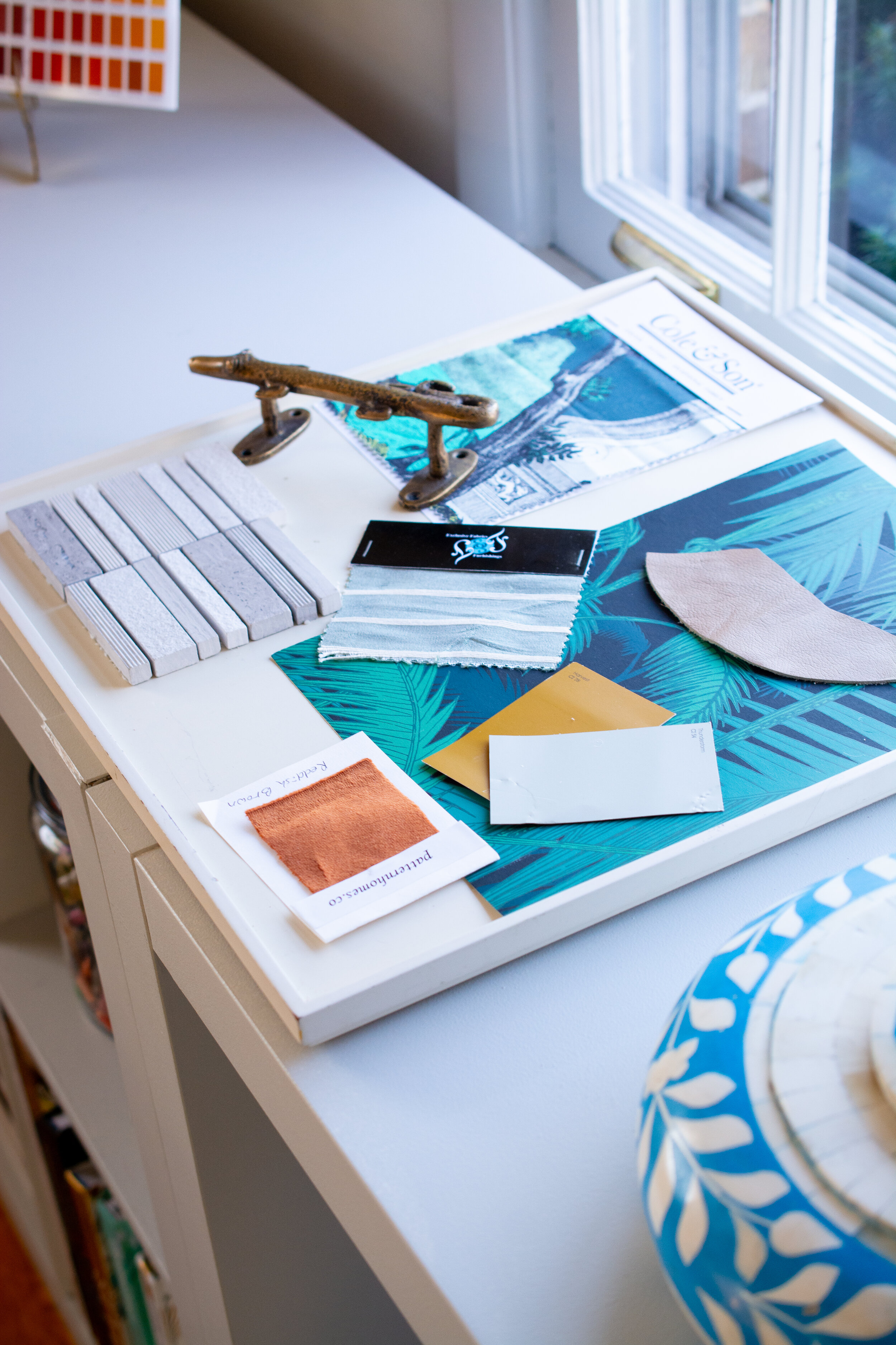
I now have plenty of surface space to lay out samples and materials.
Hausmatter Interior design studio
and create mood boards…
hausmatter interiors moodboard
So where is the gym? 🤪
All I can say is, a folding screen can do wonders!
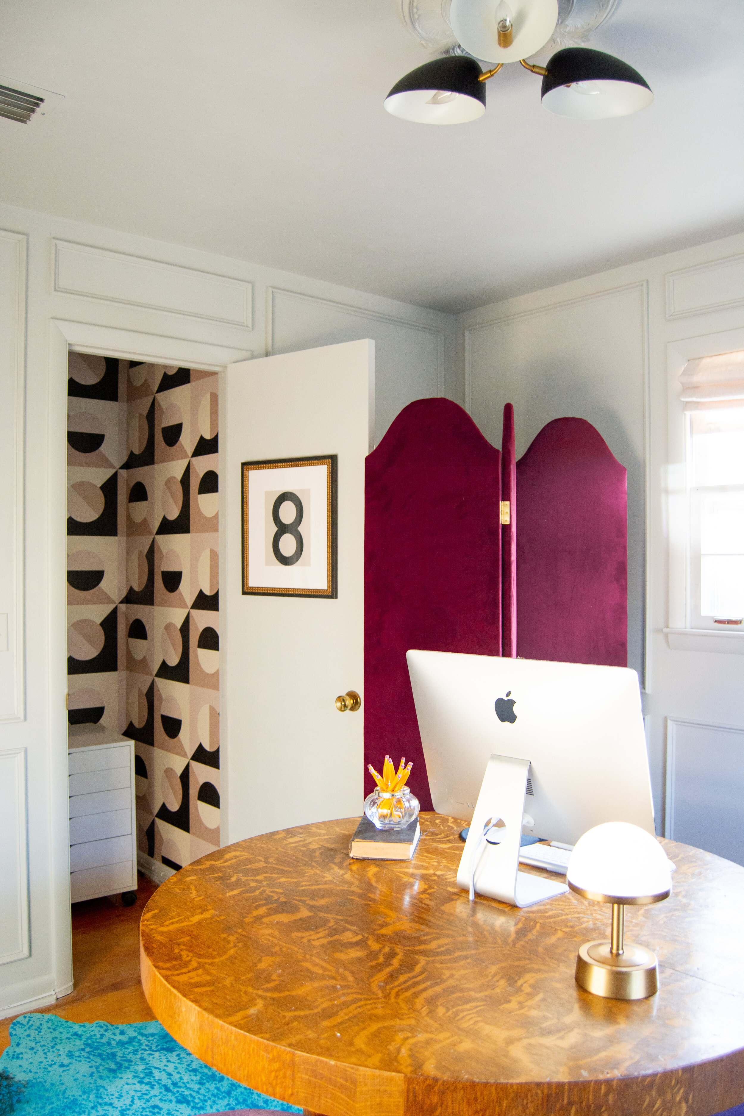
I originally planned to remove this door, but it helps conceal the treadmill that much more, so it stayed.
wallpapered closet
When not in use, my treadmill folds neatly behind the velvet screen that also gives me a backdrop to utilize for zoom calls.
ways to hide treadmill
how to conceal a treadmill
The closet in this room is rather large (compared to others in this house), so I took advantage of the extra square feet and gave it a fun makeover with this wallpaper from Spoonflower.
With people spending more time at home these days, I feel like we are starting to consider every nook and cranny of our homes as potential places to…I don’t know…hang out? Cocktail lounge anyone? It’s not far from the office if you wanna go after work ;)
I just love the way this wallpaper entirely enhances the vibe and makes this otherwise utilitarian space feel extra special.
wallpapered closet
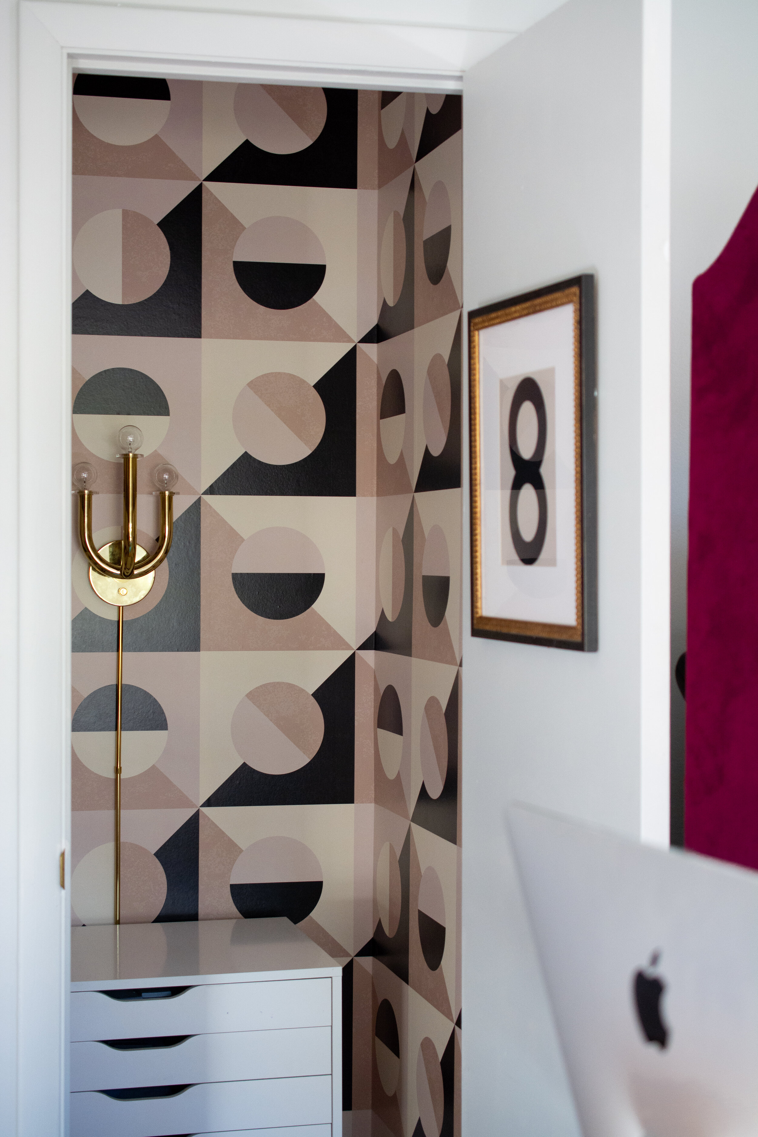
The Spoonflower wallpaper I used was prepasted, and very forgiving to work with. We used a paint roller with water to activate the adhesive - easy! I even applied it to the ceiling. It’s a closet! Why not?
The closet wasn’t wired for electricity so we installed this Jonathan Adler Wall sconce and attached the cords along the base boards.
jonathan adler wall sconce
The dimmer makes it so moody at night. Now I’m onto my second glass. LOL
wallpapered closet with jonathan adler wall sconce
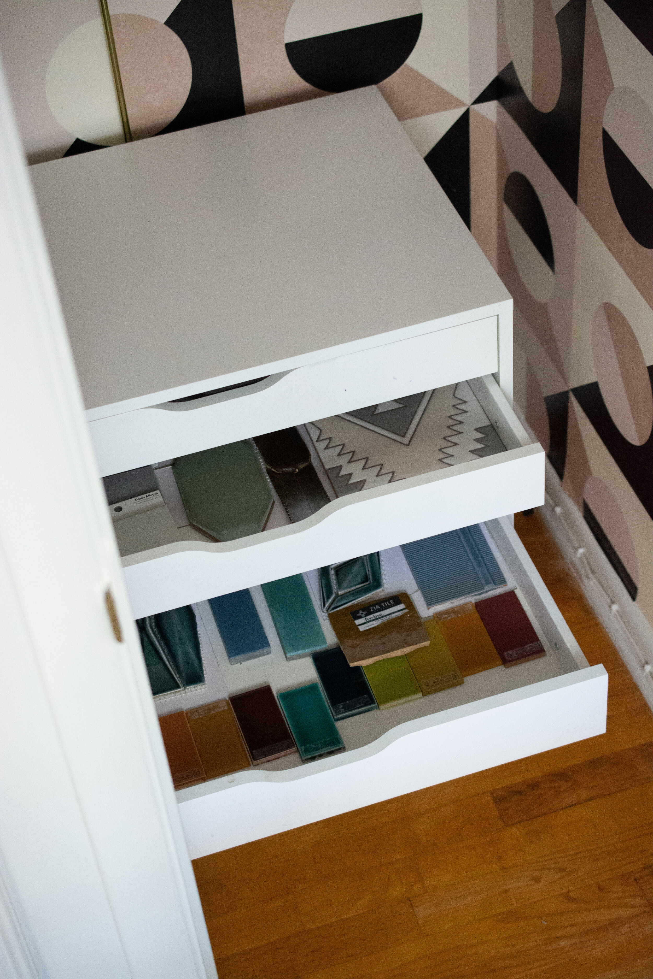
The name of this wallpaper is “Italian Tile” so I did a thing and made this a room for my tile samples. See what I did there? Clever, huh.
If I need to pull something for a client, I now have it organized all in one place.
tile samples
Staying hopeful, and living with intention feel more important than ever, so I made this memo board. Right now, it’s filled with interior design ideas and a few keepsakes, but I plan to devote half of it just for me. It’s a place I’ll tack things that inspire, uplift me and pin destinations I want to visit in the future.
Nailhead trim feels so luxe! And this project was quite easy with the help of one genius product (more on this later)
memo board with nailhead trim
Using vintage furniture leg ends as tacks, vamps up the glam-factor. I love how chippy and old they are.
diy upholstered memo board
Quirky and unexpected are what make design interesting in my book.
pencils in vintage frog vase
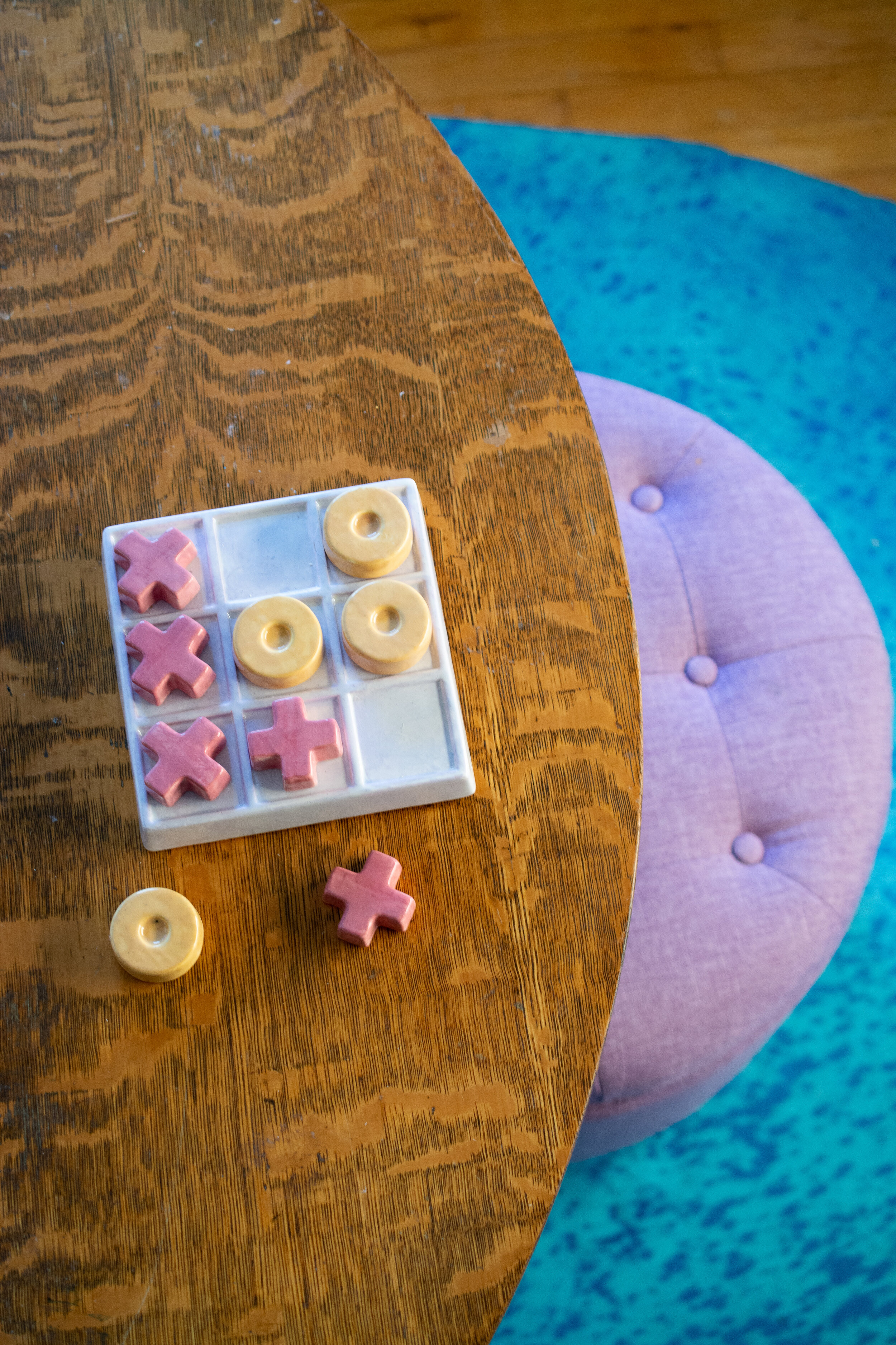
My daughter and I recently made this tic tac toe set at a local pottery painting studio. It’s so special and we’ve enjoyed having it in the room.
ceramic tic tac toe game
And there you have it! I look forward to the day clients are comfortable meeting in-person. Although I designed this room to suit the immediate needs of our family, it will one day transition seamlessly to a space clients can visit to see and touch samples, review renderings, and go over plans for their space. I can’t wait!
A big thank you to my sponsors for this project:
